Showing posts with label Ashleigh Lovitt. Show all posts
Showing posts with label Ashleigh Lovitt. Show all posts
Saturday, 8 April 2017

Wednesday, 5 April 2017
Evaluation question 5 - How did you attract/address your audience?
We attracted our audience based on the results from our pre-production questionnaire where we handed out our summary of Click. By doing this, we were able to identify areas of our film that needed improvement.
 In this screenshot from the results where we asked 10 people what genre they believed the film was, only four people believed that it was a psychological film, and even one person thought it was a crime film. These results helped us reach out and attract audiences as we changed aspects of our film to make it more identifiable as a psychological thriller and by doing so, it helped us attract an audience who were fans of that particular genre, as well as the horror genre as a whole. We believe that we achieved this as when we gave out our post production questionnaire, 8 out of the 15 people who were interviewed were able to identify the correct film genre - Psychological Thriller. As well as this, 3 people out of the 15 were able to identify that Click came under the horror category. This proves that the changes we undertook were successful as it made the film more addressing to the audience and what they would like to see on screen.

 Additionally, in our pre-production questionnaire, we asked the 10 people if they could identify what certificate they believed the film was. 7 out of 10 people believed that the film was rated 18. With this information, we knew that we did not need to change anything to make out film appear within the characteristics of a rated 18 film. Through our post-production questionnaire we knew that this was the right decision as 8 out of 15 believed that the film was an 18+. This shows that our film was going to be more attractive to audiences around that age group.
 As well as this, we made our film more addressing to audiences by using teenagers to play both the three characters and the body. We decided this would be a good idea because it makes the audience feel more anxious and scared while watching the film because the characters are around a similar age and are more relatable. This was proved right in our post-production questionnaire when we asked 15 people 'What emotion did you feel while watching this film' and 7 people said they were scared while 4 said they were anxious.
 In this screenshot from the results where we asked 10 people what genre they believed the film was, only four people believed that it was a psychological film, and even one person thought it was a crime film. These results helped us reach out and attract audiences as we changed aspects of our film to make it more identifiable as a psychological thriller and by doing so, it helped us attract an audience who were fans of that particular genre, as well as the horror genre as a whole. We believe that we achieved this as when we gave out our post production questionnaire, 8 out of the 15 people who were interviewed were able to identify the correct film genre - Psychological Thriller. As well as this, 3 people out of the 15 were able to identify that Click came under the horror category. This proves that the changes we undertook were successful as it made the film more addressing to the audience and what they would like to see on screen.
 Additionally, in our pre-production questionnaire, we asked the 10 people if they could identify what certificate they believed the film was. 7 out of 10 people believed that the film was rated 18. With this information, we knew that we did not need to change anything to make out film appear within the characteristics of a rated 18 film. Through our post-production questionnaire we knew that this was the right decision as 8 out of 15 believed that the film was an 18+. This shows that our film was going to be more attractive to audiences around that age group.
  As well as this, we made our film more addressing to audiences by using teenagers to play both the three characters and the body. We decided this would be a good idea because it makes the audience feel more anxious and scared while watching the film because the characters are around a similar age and are more relatable. This was proved right in our post-production questionnaire when we asked 15 people 'What emotion did you feel while watching this film' and 7 people said they were scared while 4 said they were anxious.
 Evaluation question 2 - How does your media product represent particular social groups?

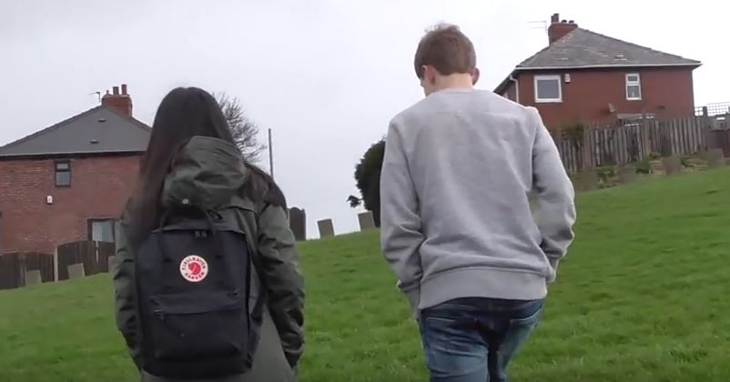

However, towards the end of the film both Gemma and Tom behave in a way that supports their representation. When all three of them find the body, Charlie runs up to it (shown through another point of view shot signifying his deranged behaviours) which shows how normal the others are behaving. While Charlie is touching the bodies blood, Tom and Gemma try call the police/get help. This supports the typical representation of young people as they do not do anything irrational - they try to do the right thing.
Tuesday, 4 April 2017
Monday, 27 March 2017
Analysis of a title sequence - Se7en
In the beginning of the title sequence, we see many props that are used which indicate to the audience that the film is about two detectives, the pen, crime scene photos all contribute to this idea. These props seem to be being put into a formation which also backs this up as detective’s piece case information together to build up a bigger picture – which happens to the audience as they are given a general idea as to what the film is about.
Most of the items in the shots are very close up. This creates suspense amongst the audience as they are unsure as to who is behind what is happening and what their face is: it could be the killer. The close up of the objects can also be to ensure the audience recognize those props for later on in the film as they could hold some significance throughout the plot.


 The whole title sequence is light very dark which connotes
danger to the audience as well as suspicion as it is obvious the shots are done
inside – showing the person behind it does not want to be known. Despite most
of the title sequence just being in black and white, there is also a couple
shots of developing photos that are red. Red usually implies a threat or a
hazard which is possibly very important towards the plot of the film.
The whole title sequence is light very dark which connotes
danger to the audience as well as suspicion as it is obvious the shots are done
inside – showing the person behind it does not want to be known. Despite most
of the title sequence just being in black and white, there is also a couple
shots of developing photos that are red. Red usually implies a threat or a
hazard which is possibly very important towards the plot of the film. The titles themselves are in a handwriting font. This creates an eerie theme as the audience can question who the handwriting actually belongs to – the killer, detective or victim.

Saturday, 25 March 2017
Monday, 20 March 2017

Tuesday, 14 March 2017


Subscribe to:
Posts (Atom)